What to wear at your personal branding shoot
Branding Photoshoot Wardrobe Guide
What you wear for a personal branding photoshoot should do more than make you look good.
Your clothes are part of the message.
Before somebody reads a word on your website or LinkedIn profile, your photographs are already communicating something about you: your confidence, personality, professionalism, creativity and the kind of experience people can expect from your brand.
That’s why I don’t believe in choosing outfits simply because they are fashionable.
I want your wardrobe to feel like you, fit the aesthetic of your brand and help create the right emotional response in the people you want to attract.
How many outfits should you bring to a personal branding shoot?
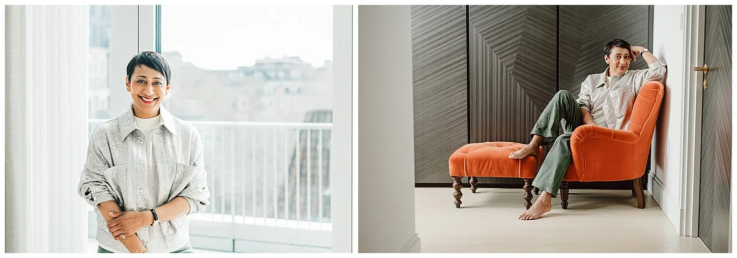
For a full personal branding shoot, I generally recommend around 4 to 5 outfit changes.
The aim is to create variety without making the photographs feel like they belong to completely different people.
I usually like to mix different levels of formality.
That might include:
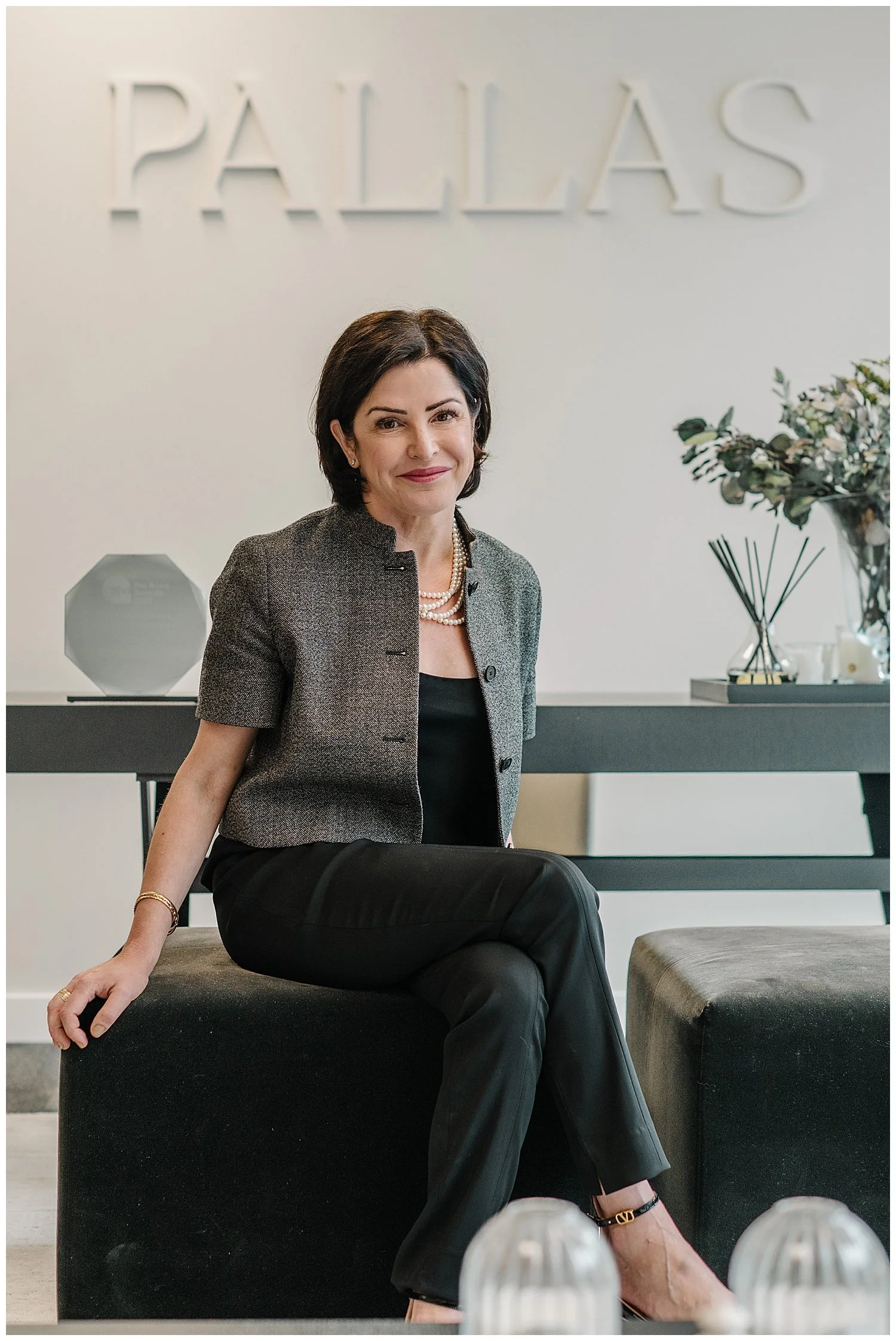
A highly polished professional look
A smart but approachable outfit
A more relaxed business look
Something casual
One outfit that shows more personality or creativity
This gives you photographs that can work in different places.
A polished outfit might be perfect for your website, press or speaking profile, while something more relaxed may work beautifully for LinkedIn content, newsletters or social media.
Your brand has more than one mood, so your photographs should too.
Should you wear professional or casual clothes?
Usually, both.
Female founders often need to communicate more than one aspect of themselves.
You may need to look authoritative and credible in one image, warm and approachable in another, and relaxed and human somewhere else.
That is why I prefer creating a wardrobe with different levels of formality rather than shooting five variations of essentially the same outfit.
For example:
Professional:
A beautifully tailored suit, blazer, dress or structured separates.
Smart:
A blouse, knitwear, trousers, skirt or blazer styled in a slightly softer way.
Relaxed:
Jeans with a beautiful shirt, knit, jacket or elevated T-shirt.
Personal:
Something that reflects your individual style and would immediately feel recognisable to people who know you.
The important thing is that every outfit still belongs to the same person and the same brand.
hould you follow fashion trends for branding photos?
I generally recommend avoiding very obvious trends.
Personal branding photographs should ideally remain useful for longer than one fashion season.
A very fashionable outfit may look wonderful today but can date your photographs surprisingly quickly.
Instead, choose pieces that feel contemporary but still reflect your established personal style.
A good test is:
Would I still happily wear this in two years?
If the answer is yes, it is probably a stronger choice than something you bought purely because it happens to be fashionable right now.
Timeless does not mean boring.
It means choosing clothes that feel genuinely yours rather than letting the current trend become the most memorable thing in the photograph.
How should your clothes reflect your personal brand?
Start by thinking about how you want people to feel when they encounter your brand.
Do you want to communicate:
Authority?
Warmth?
Creativity?
Luxury?
Energy?
Calm?
Approachability?
Innovation?
Confidence?
Trust?
Then look at your clothes through that lens.
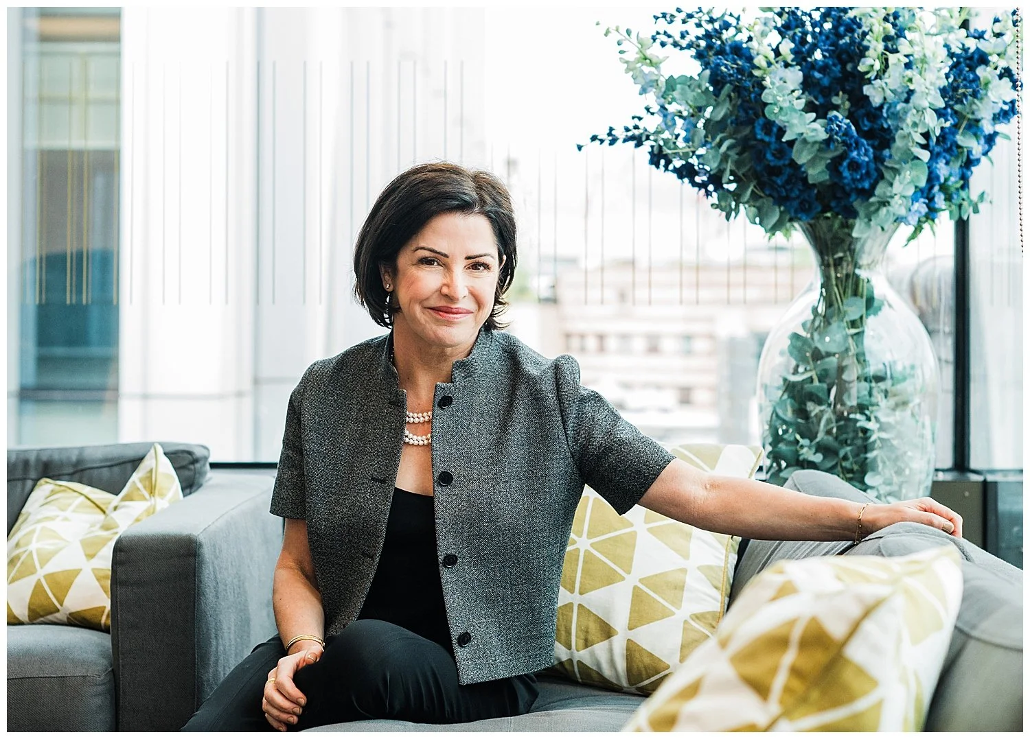
A founder building a premium consultancy may want tailored pieces, sophisticated fabrics and a restrained colour palette.
A creative director may want stronger colour, unusual shapes and more expressive styling.
A wellbeing founder may want softer fabrics, natural textures and calmer tones.
Neither is better.
The question is whether your wardrobe supports the message you want your photographs to communicate.
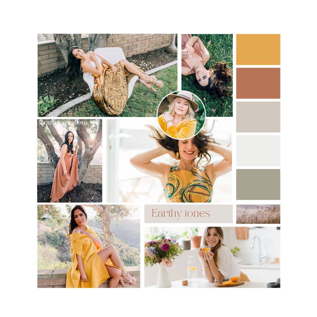
Why does colour matter in personal branding photography?
Colour has an emotional effect.
It can influence how a brand feels before someone consciously thinks about why.
Branding research commonly associates colours with different perceptions. Blue, for example, is often connected with trust and stability, while black can suggest sophistication or luxury. Green is frequently associated with calm, balance and nature, while warmer colours such as orange and yellow can communicate energy and optimism. These associations are not universal, though: culture and context influence how colour is interpreted.
So I never suggest choosing a colour simply because somebody says:
“Red means confidence.”
Instead, we ask:
Does this colour fit you?
Does it fit your brand?
Does it work with your website?
Does it work with the environment we are photographing you in?
And, most importantly:
What feeling do you want the image to create?
Should you wear your brand colours?
Sometimes, but you do not need to dress like your logo.
Your brand colours can be introduced subtly through:
Clothing
Accessories
Jewellery
Backgrounds
Furniture
Locations
Props
Flowers
Artwork
If your brand has a distinctive colour palette, including hints of those colours can make your images feel much more connected to your website and marketing.
Consistency in colour can also strengthen brand recognition across different touchpoints.
But the photographs should still feel sophisticated.
If your logo is bright orange, for example, that does not necessarily mean you need to wear an orange suit.
Perhaps the colour appears in a chair, notebook, scarf or background detail instead.
Should all your outfits be the same colour?
Usually not.
Variety makes your final image library much more useful.
If every outfit is black, the photographs can begin to look like they came from one long session, even when we change the location and pose.
I like creating enough variation that you can use the images across several months of marketing without them all feeling identical.
That might mean mixing:
Neutrals
Brand colours
One stronger statement colour
Light and dark outfits
Different textures
The photographs should still feel cohesive, but not repetitive.
What colours photograph well?
The best colour is the one that works with your skin tone, brand, location and intended mood.
Rich jewel tones can photograph beautifully and often create a polished, premium feel.
Neutrals such as cream, camel, navy, grey, black and white can create timeless images and work particularly well when the environment provides colour.
Pastels can create a softer, warmer feeling.
Strong colours can be extremely effective when confidence, creativity or energy are central to the brand.
The key is not choosing colours in isolation.
Clothing, background and location all need to work together.
Should you wear patterns?
Patterns can work, but I usually prefer them to be intentional rather than dominant.
Very small, busy patterns can sometimes distract from your face or create unwanted visual effects on camera.
Large, graphic prints can work brilliantly if bold visual identity is part of your brand.
Again, the question is:
Do we notice you first, or the outfit?
For most personal branding photographs, I want you to remain the focus.
What about logos and words on clothing?
Unless a logo is part of your brand story, I generally avoid large visible logos and slogans.
Text on clothing can become distracting, partially hidden or difficult to read depending on the pose and crop.
Your photographs should promote your brand, not somebody else's.
How should you choose clothes for the location?
Wardrobe and environment should be planned together.
A tailored suit can look fantastic against striking architecture or in a premium office.
Relaxed jeans and knitwear may work beautifully in a creative workspace or informal café setting.
A highly patterned outfit against a visually busy background can become overwhelming.
That is why I prefer planning clothing and locations at the same time.
They are both part of the same visual story.
Should you create a Pinterest board before your branding shoot?
Yes. I find visual references extremely useful.
A Pinterest board can help you and your photographer define the mood of the shoot before the day itself.
It can include:
Clothing
Colour palettes
Locations
Lighting
Interior design
Poses
Editorial photographs
Architecture
Textures
Brand imagery
Expressions
Overall mood
The point is not to copy another person's photographs.
It is to identify patterns.
Perhaps every photograph you save has beautiful natural light.
Perhaps you keep choosing tailored clothing.
Perhaps you are repeatedly drawn to architectural environments, muted colours or very relaxed expressions.
Those patterns tell us something about how you want your own brand to feel.
Photography professionals also recommend using shared Pinterest boards during pre-shoot planning to establish the look and feel of a branding session, while treating the images as inspiration rather than photographs to replicate exactly.
What should you put on your Pinterest board?
Don't overthink it.
Save anything that gives you the feeling you want your brand to have.
That could be a photograph because you love:
The outfit
The pose
The lighting
The location
The colours
The expression
The mood
The crop
The styling
You may even save interiors, magazine covers or fashion campaigns rather than personal branding photographs.
Sometimes those references tell me much more about your aesthetic than another headshot ever could.
What should you avoid wearing?
I generally suggest avoiding:
Clothes you constantly need to adjust
Anything that does not fit properly
Very obvious short-term fashion trends
Large distracting logos
Extremely busy patterns unless they are deliberately part of your style
Clothes you have never worn before and don't feel comfortable in
Several outfits that look almost identical
Anything that feels like somebody else's version of “professional”
The most expensive outfit in your wardrobe isn't necessarily the best one.
Confidence photographs better than a label.
Should you buy new clothes for your branding shoot?
Not necessarily.
Start with your own wardrobe.
Look for the pieces that already make you feel:
Confident.
Comfortable.
Professional.
Attractive.
Like yourself.
Those are usually excellent starting points.
Then, if we identify a genuine gap in the visual story, you can add one or two pieces rather than rebuilding your entire wardrobe for the shoot.
How should female founders plan 4 to 5 branding outfits?
A simple formula might look like this:
Outfit 1: The authority look
Your most polished, professional outfit.
Outfit 2: The approachable expert
Professional but slightly softer and more relaxed.
Outfit 3: The everyday founder
What you genuinely might wear while working or meeting clients.
Outfit 4: The personality look
Something that expresses more of your individual style.
Outfit 5: The flexible casual look
Something simple, timeless and easy to use for informal marketing content.
Together, those outfits give you a visual range rather than five versions of the same message.
What is the most important thing to remember?
Your clothes are part of your brand storytelling.
A personal branding photograph is going to make somebody feel something.
The clothing, colour, environment, expression and body language all contribute to that feeling.
So don't begin with:
“What should I wear?”
Begin with:
“How do I want people to feel when they see me?”
Then we build the wardrobe around the answer.
Creative Brand wardrobe ideas:
- Women: Trendy blouse with high-waisted trousers or a stylish dress. Bold yet tasteful accessories.
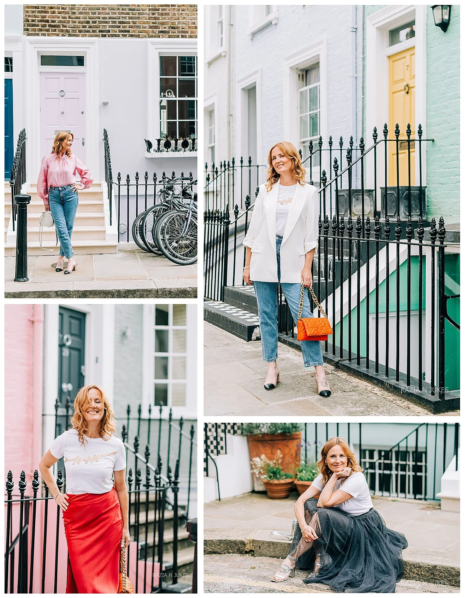
Casual Brand:
- Women: Casual dress or blouse with jeans and comfortable shoes. Simple accessories.
- Men: Polo shirt or casual button-down with jeans or chinos. Casual yet neat shoes.
Additional Tips:
1. Bring Multiple Outfits: If possible, bring a few different outfits to the shoot. This allows for variety in your photos and ensures you have options.
2. Test Your Outfits: Try on your outfits before the shoot to ensure they fit well and look good on camera. Take some test photos to see how they appear.
3. Coordinate with Background: Consider the colours and style of the background to ensure your outfit complements the setting.
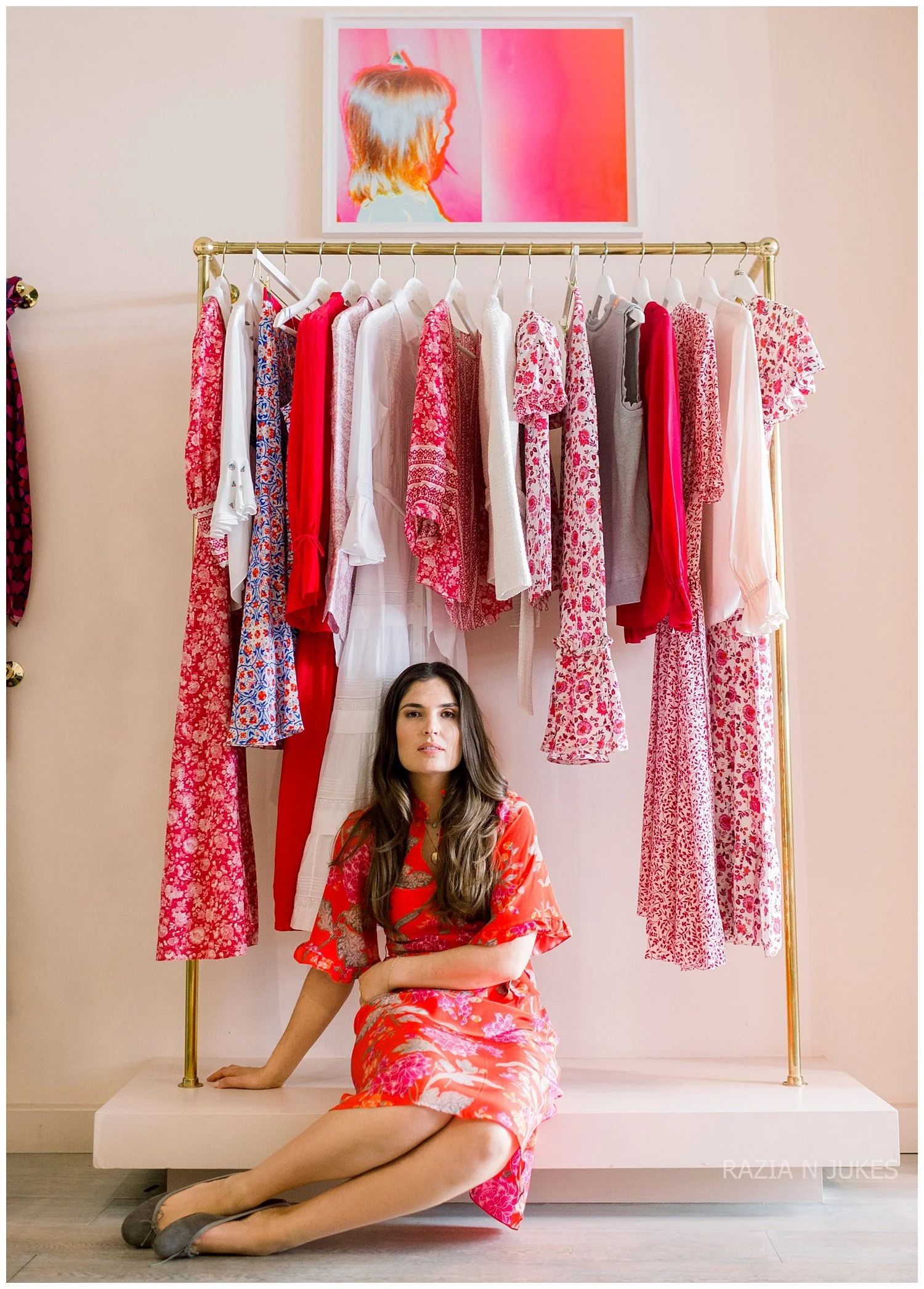
By following these guidelines, you’ll be able to choose outfits that not only look great but also represent your brand effectively, helping you create a strong and professional visual identity.
I’m Razia Jukes, a London Headshot & Personal Branding Photographer helping female founders become the face of their brand.
Before every branding shoot, we look at clothing, colour, environment, audience and visual storytelling so your images don't simply look beautiful — they communicate the right message about you and your business.